
Fernhill Physical Therapy
Concept. Fernhill Physical Therapy is an invented business.
What makes Fernhill different takes an hour. Try fitting that on a sign.

A new clinic with a blank wall behind the desk
We invented Fernhill as a new physical therapy clinic on Haywood Road, a real street in West Asheville, North Carolina.
Five therapists treat back and neck pain, sports injuries, recovery after surgery, balance and pelvic health. Every session is a full hour, one to one, with the same therapist from the first visit to the last.
Its patients sit at desks all day or run trails all weekend. Some are home from knee or hip surgery. Some are older and worry about a fall.
It opens with no logo and no sign. From the sidewalk, nothing says a word about the hour.
The green came later. First, three lines.
We wrote these three lines ourselves. Each one leads to a choice further down.
-
A new face each visit
“Third visit, third therapist. I started from the beginning again.”
Our reading: The same therapist is Fernhill’s answer, so it goes first. Equipment and credentials can wait.
-
No end in sight
“Nobody would say how many visits. I just kept booking the next one.”
Our reading: Put the plan on paper, early, as steps a patient can hold and count.
-
The walk they want back
“I don’t need an anatomy lesson. I want to walk the ridge with my dog.”
Our reading: Anatomy charts and clinic blue talk about the knee. The patient is talking about the ridge. Fernhill should look like the hills.
Our call
This is the sentence we’d build Fernhill on.
Fernhill is the West Asheville clinic where one therapist gives you a full hour, every visit.
Left for later: separate looks for sports and pelvic health. A new clinic needs one clear face first.
Not one swatch is blue


Logo
A sprout grows from a single hill arc, beside the name in Young Serif. The hill is the place patients want to get back to. From line 3.
Colors
Ink #16302A and Green #1F6B52 sit on Paper #F4F6F2. Mint #CDE6D8 and Peach #F2B48C are the accents. Deep green looks like the ridge outside the window. Clinic blue looks like a hospital. From line 3.
Typefaces
Young Serif sets the headings. Figtree sets body text, plans and forms. Young Serif sounds like a person talking. Figtree stays clear in the small print of a plan sheet. From line 2.
Devices
- Sprout line: one dot per step on a level line that rises to a leaf. It carries the plan on the exercise sheet. From line 2.
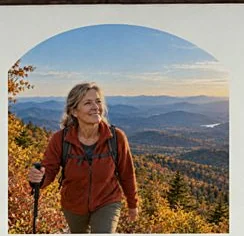
- Ridge window: a photo frame with the hill arc on top. It holds the photo on the trailhead poster. From line 3.
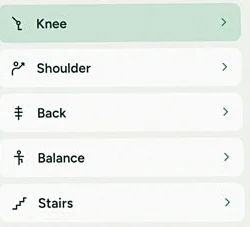
- Movement icons: outline icons for body areas. They sit beside Knee, Shoulder, Back, Balance and Stairs on the booking screen.
One sore knee, from the trailhead to the fridge
-
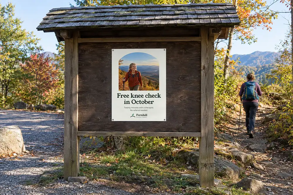
Morning, the trailheadA hiker’s knee starts to ache. The poster pictures the walk they want back. -
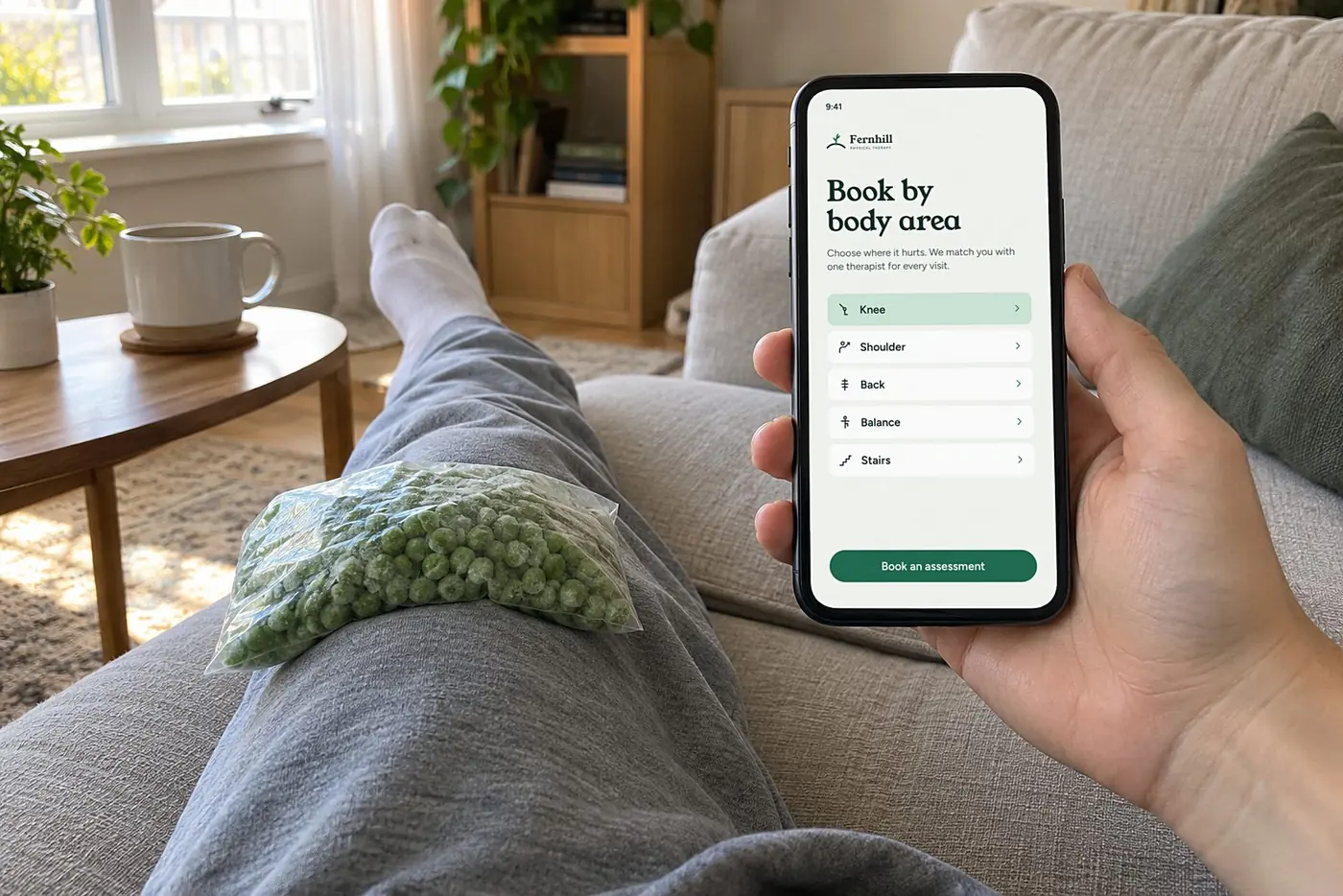
Evening, the sofaBooking starts with where it hurts. -
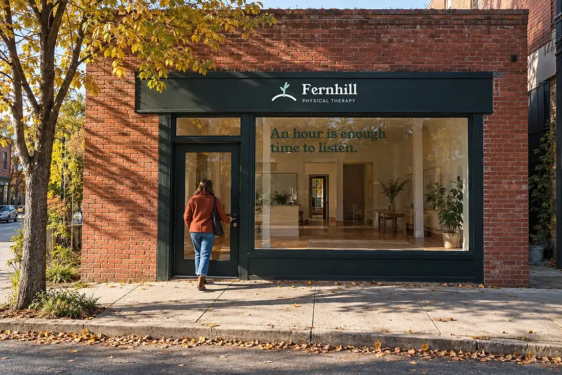
First visit, Haywood RoadThe hour fit on the glass. -
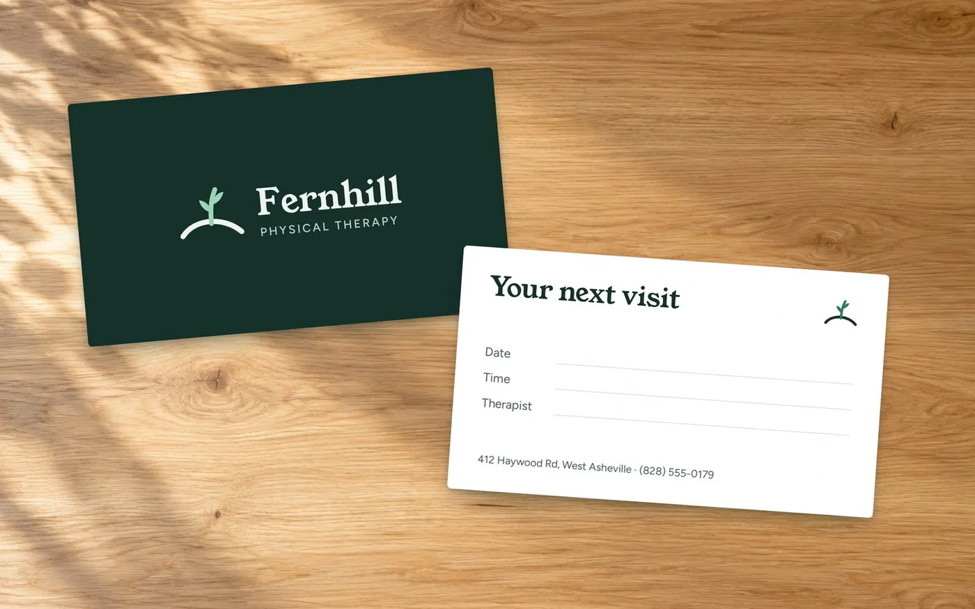
After the visit, the front deskThe card has a space for the therapist’s name. It’s the same name every visit. -
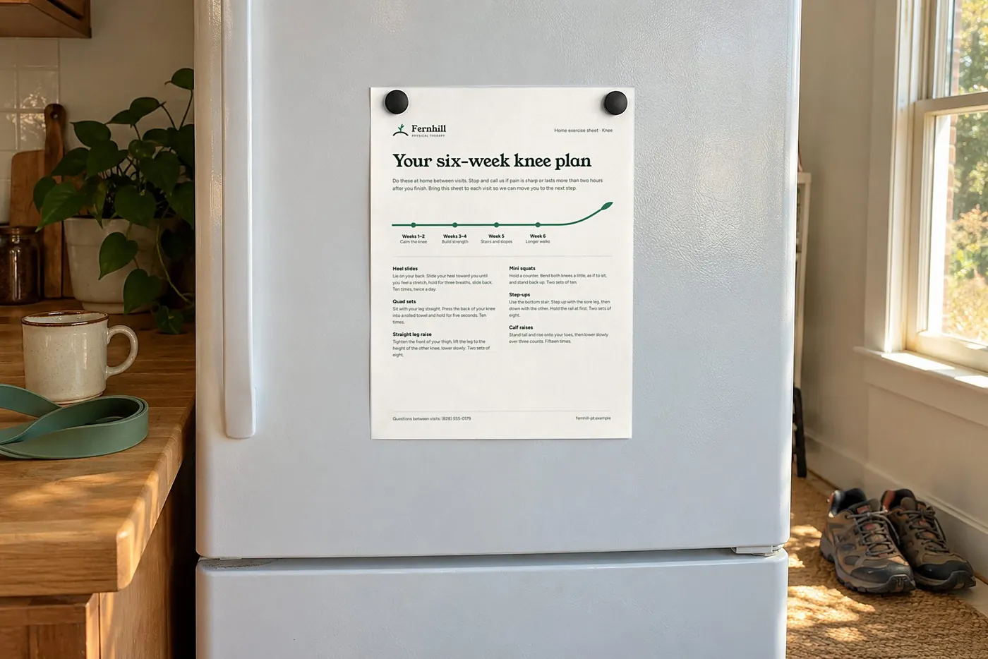
Next morning, the fridgeThe last step of the six-week plan is longer walks.
Fernhill’s patients are made up. Your customers aren’t.
The free Brand Opportunity Report quotes real customers in your market: 3 to 5 findings in their own words, each with our reading. It’s yours to keep, even if you stop there.
Brand Identity is the offer behind work like this.

